

Similarities:
All the magazine covers have a big, bold masthead.
Along with this all the magazines use direct address.
The People and Let's knit magazines both use multiple images on their cover.
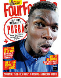
Glamour and FourForTwo both use white backgrounds on their magazine cover
From this I have learn't that magazines use anchorage texts and strap lines as a method to relate to their target audience to get them to read their magazine.
In terms of the double page spreads, they all contain a main title.
The Fiercely Creative, Dinosaur Life and Maximum dbs contain a title that isn't their name or don't have their name in the title.
They all contain a big, main image that is a person apart from one.
All the dbs that contain an image of a person, use direct address.
Differences:
The Dazed magazine cover simply has just an image of Rihanna and a masthead whereas the rest of them has things such as strap lines and anchorage texts.
The runner magazine cover is the only one that has an actual image as its background.
Only Dazed and L'Officiel have white masthead.
The one containing Nicki Minaj has her name in pink and bold whereas the other two double page spreads don't contain the name of the person in the main image.
The Nicki Minaj dbs also contains a lot more text that the other dbs as the other one is mainly taken up by big text.
The dbs with the title as 'Fiercely Creative' has it's main image taking up half of the double page spread
Only the Maximum double page spread contains an image that first of all, doesn't cover a large amount of the dba and isn't an image of a person.